PEPPERTOWN IS HERE!!!

BUBBLE FOX

BUBBLE FOX
Now "Popping" at the CRAZY Forest! Updates Tuesdays and Thursdays

Check Out My Twitter

Wednesday, February 22, 2023

MIXED MEDIA MAYHEM!!!

Welcome back to the CRAZYVERSARY!!!  It's the last week, but don't worry folks.  We got something really cool lying in wait, but more on that later.  It's time for some art!  Fine art even!  And today we got a triple shot!  So sit back, relax and take a look at the creative process in motion!  Gonna be your last chance for awhile anyway, but again, more on that later!  Enjoy...

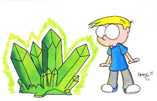
So the last few weeks you've seen some of my attempts at oil pastels.  Well, in addition to those, I've also been dabbling in other mediums, mainly watercolors and colored pencils.  My watercolor efforts have been less than stellar, hence the reason you don't see any on here.  Colored pencils, however, have been a little easier to grasp.  All three of today's pieces are the same line art, just colored in different ways.  The piece above was done using colored pencils.  It's medium I'm getting more and more into the more I use them.  I especially like the way they blend.  Much like pastels, you can create some really cool effects by blending colored pencils.  For the most part, I'm fairly satisfied with the attempt above, with the exception of the skin tones.  Despite using the same color types as my markers (I use PrismaColor for both mediums), this kid looks anemic!  I guess PrismaColor pencils go on lighter than their ink counterparts.  This leads to a very important thing I learned about colored pencils: USE QUALITY PRODUCTS!!!  Normally, I'm all about affordability and using cheaper supplies to practice with until an artist is ready to make the jump to real supplies.  With colored pencils though, and even certain paints, you really can't skimp!  My first attempts with colored pencils were with an Artist's Loft set, which is a Michaels brand.  Good God were those things crap!  Tips kept breaking, colors were off and they couldn't even blend!  I think Crayola pencils might actually be of higher quality!  It was certainly an eye opener for sure.  Hate to say, but if you're looking to try colored pencils, spring for a quality brand!

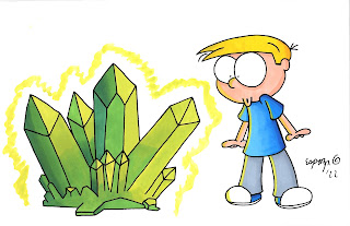
Next up, a more traditional medium that I'm far more familiar with: Markers!  Not much to explain here.  I used the same color choices as I used for the colored pencils.  Depending on the color, PrismaColor markers will either lighten or darken as they dry, so a piece can look very different within a few hours of finishing.  I will say I've gotten so much better with markers over the years, especially now that I've learned blending and shading.  Ironically enough, some of these techniques I learned completely on my own by accident!  Always funny when things work out that way, am I right?  The only downer really are the marker highlights.  Highlight colors have to go on first and as such, they don't always blend in too well with other colors, especially lighter ones.  Of course, there is another solution to that...

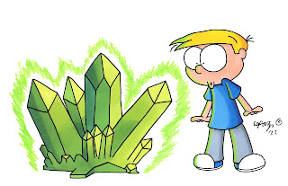
We see the same piece yet again, but this time I mixed things up...  LITERALLY!!!  You see, I went in with a marker base and even did the shades in marker, but then I added a layer of colored pencil highlights on top that look more natural and didn't mix in with the markers.  I even added a color pencil sheen to the crystals!  It's nice to know that the countless hours I spent watching YouTube tutorials during the pandemic are really starting to payoff here!

And that's a wrap for February 2023!  Sheesh, two months down already?  It'll be Summer time before we know it!  But before Summer, there must come Spring, and with that comes one of my favorite events!  That's right CRAZIES, it's almost time for WonderCon,  and starting next week, we're bringing back the CRAZY WonderCon Countdown, a look back at all the fun of the past while getting hyped for the future!  So be sure to come back have some retro-tastic fun as the art gives way to the cosplay!  Until then, take care, stay safe and I'll catch y'all later!

Wednesday, February 15, 2023

WHERE CHERRY TREES BLOSSOM...

WOOOOOOOOO!!!  Halfway through February and we are now at the start of SHAMROCK SHAKE SEASON!!!  And if that weren't cool enough, there's also a crap ton of half-priced Valentines candy waiting to be bought and the XFL returns this weekend!  Granted, I'll likely miss most of the games because of work, but that's why God created DVR!  I realize I look at the 2001 XFL with rose-colored glasses, but I'll always contend that it wasn't as bad as they try to make it out.  The tech they introduced certainly caught on and the 2020 reboot of it was phenomenal!  They were making good strides until a little turd called COVID had to go and ruin things.  But we're beyond that now to a degree and hopefully things will work out this time around.  Until then, let's keep the CRAZYVERSARY party going with more attempts at me jumping from cartooning to fine art!  Enjoy...

Cherry tree blossoms.  One of the first real signs that spring is on its way!  Here in San Diego, cherry trees have a deeper significance.  One of our sister cities is Yokohama, Japan.  Many years ago, our friends in Japan gifted us some cherry trees which currently reside at the Japanese Friendship Garden in Balboa Park.  Through the years, many events came to pass, but through it all, our friendship with our sister city endured and as a true testament of that, so have those cherry trees, which still stand and grow and blossom to this very day.  It's a beautiful legacy.  With this piece, I was mostly just trying new techniques involving blending and stippling.  One of the cooler things about oil pastels is that in addition to being able to seamlessly blend colors, you can also layer individual colors on top of each other with little to no blending!  You can definitely get some cool effects with it.

For this one, I was trying to be a little more detailed with it, though I wasn't quite as successful as I was in the piece above it.  Objects off in the distance are a little more forgiving in that they're naturally out of focus, so closeups are a little more difficult.  Especially when using a medium like pastels where there isn't a fine point!  Still, I'm happy with the outcome, especially with glowing effects of the clouds and moonlit hills.  The black paper used was both a stylistic choice and an experimental choice.  It's a vellum surface, so there is a bit of a tooth to it, though not as much as actual pastel or colored pencil paper has.  Admittedly, it didn't blend as easily as it would have on toothier surfaces, but by and large vellum paper still works well enough.  The reason you want to use a toothy or rougher surfaced paper is so that the pastels will blend better.  It you're using smooth paper, it'll slide right off!  I haven't tried it on a white vellum surface yet, but that day is coming!  I should also note that if you are using a black paper, you're gonna want to use your brightest colors as the darker colors, even some of the middle shades, will just blend in with the background.  Also, when finished, coat with a matte sealer.  It'll preserve the piece, keep the pastels from smearing, and, should you want to, even allow for further tinkering as matte finishes are toothy!

Well, another week down and only one post left in February!  We're switching gears a little bit for the finale as another medium I've been experiment with gets center stage, so be sure to come back and check it out!  Until then, take care, stay safe and I'll catch y'all later!

Wednesday, February 8, 2023

THIS TIME OF YEAR?!? THIS TIME OF DAY?!?

We are back!  Not only is the CRAZYVERSARY is still going strong, but we are THAT much closer to one of my favorite times of year: SHAMROCK SHAKE SEASON!!!  Oh yes!  Those gelatinous, minty green shakes that the Golden Arches only serve for roughly one month will be back next week and I fully intend to indulge!  Don't know why they are so addictive, but I just can't get enough of them Shamrock Shakes!  But enough about that.  It's art time!  And I have another fine art piece to show off!  So sit back and take a good long look at my attempt at being more cultured!  Enjoy...

An aurora borealis, one of nature's truest beauties (And a great payoff to one of The Simpsons' funniest bits!).  I won't pretend to act like I know the science behind them because I don't.  I'll just stare in awe at the amazing sights they produce.  This was among my first successful attempts at using oil pastels.  For those that have never used them, they're essentially glorified crayons.  They're made of wax and oil and as such are really greasy!  They are a messy medium for sure, but the effects you can get with them are amazing, especially when it comes to blending.  I learned that one of the most important things you should do when using oil pastels is use a proper paper stock!  You're definitely NOT going to want to use these on standard printer paper or card stock, nothing with a smooth surface.  A thicker paper stock with a toothy surface is best.  They do make paper specifically for pastels, but it can be expensive.  I've found that colored pencil paper and mixed media vellum-surfaced paper are cheaper and fairly effective alternatives.  Watercolor paper can be used, but it will take a lot of coloring to get the effect as the surface is more porous than toothy.

Another week down in our February march!  Be sure to come back next week with a double dose of oil pastel intrigue!  I think next week's art will really grow on you!  Until then, take care, stay safe and I'll catch y'all later!

Wednesday, February 1, 2023

CELEBRATE 13 YEARS OF THE CRAZYVERSE WITH... FINE ART?!?

Welcome to February CRAZIES!!!  The month of romance is here, though if you don't have a significant other, I guess Pink Halloween is kind of pointless.  But hey!  There's candy at least!  That's cool, right?  Well I feel no need to keep yammering on here.  After all, this month also means that the CRAZYVERSE is now 13 years old!  We've reached blog middle school!  And if it's anything like actual middle school was, I'll probably wanna forget that it ever happened!  Normally I'd be doing something Mike & Mindy-related this month, but this year, we're doing things a little bit differently.  Over the years, I've really grown as an artist.  I'm obviously not turning into Charles Schulz, but I have in recent years really started branching out and trying other things, some of which I've posted.  Mixed media art and mediums beyond markers and digital have really become a bigger part of my skillset since the pandemic, with oil pastels and colored pencils especially factoring into my artwork more often.  This month, I thought it'd be cool to share some of that artistic growth with you, the CRAZY faithful.  After all, 13 years is a long time to NOT try and learn something, so here we go!  Enjoy...

Despite the color choice, I wasn't feeling blue when I made this!  In fact, this was used for the background of my Christmas art last year!  I had tried to do it with watercolors, but it just wasn't happening.  It ruined my original art for it even, so I had to start over.  In the end, I chose oil pastels on colored pencil paper and simply combined it using Photoshop Elements with a drawing of Pepper from Bubble Fox that had been colored in marker with colored pencil highlights.  I was trying to go with a wintery feel, which is why I took the blue route, despite blue not typically being a Christmas color.  I do like the end result though.  The shades of blue blended quite well.  Even as is with the eventual foreground elements not included,  I think this piece really works.

And that's all she wrote for Week 1 of February 2023!  Be sure to come back next time for a little more winter fun with oil pastels as the elements of nature take center stage!  Until then, take care, stay safe and I'll catch y'all later!